We got new packaging!


Hey everyone! Chris and Andrew here. We are super, super excited to finally share these new bags!
We’ve been working on these for a long time. Way too long. We don’t want to even think about all of the time we’ve spent on Pinterest, scribbling on white boards, and cutting out prototypes. But we really wanted to get it right, and we think we’ve made a really fun package here. It’s been a super illuminating journey and has had us re-evaluating how we think about Boomtown as a brand, what’s important to us when it comes to coffee packaging, and how we can convey the wonder we have with coffee to the shelf.
First, Some Reflection
Starting a creative project from scratch can be daunting. If you don’t have constraints, the openendedness of everything can actually make it harder to take the first step. Instead of just busting out the crayons, we had to think about what we really wanted to accomplish.

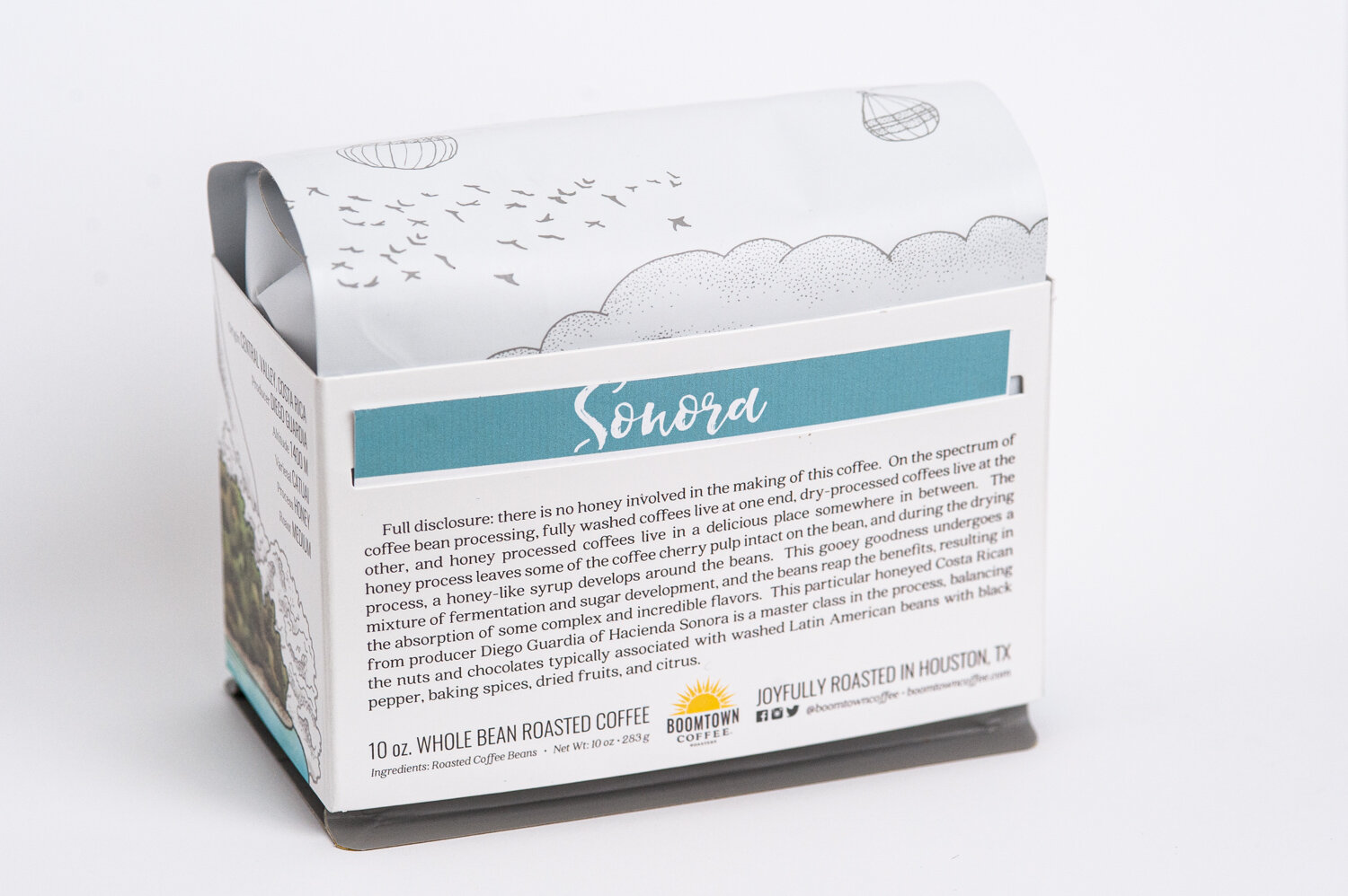
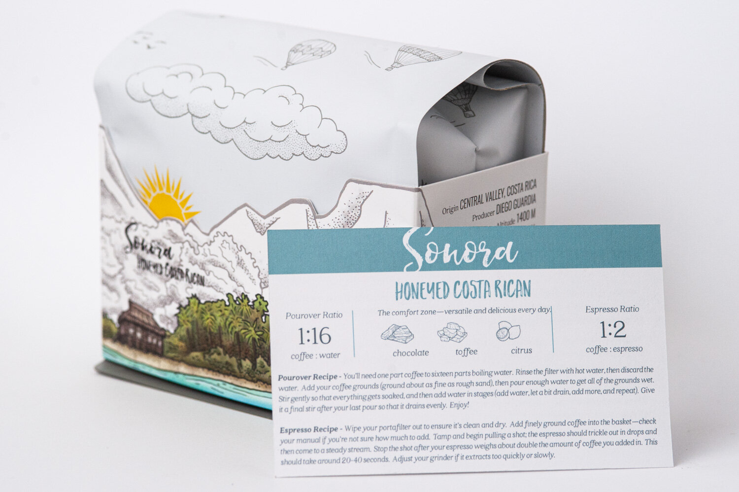
With the old labels, we tried to show information. We wanted to tell you every flavor note; we wanted to color code by region and give you a map and have a note from the roaster. We wanted to transfer a bit about how we evaluate the coffee in the cupping lab to the bag. After some thought, however, we realized that when we’re in another coffee shop, we don’t usually buy coffee based on those things.
Sure, we look at the main categories like country of origin and processing method, but we actually found ourselves more-often-than-not asking the baristas for recommendations or trying a cup first. After all, it’s hard to describe a coffee in just some flavor notes written on the bag.
What was the coffee’s character? Why exactly is this one your barista’s favorite? Where will this coffee take me?
Inspiration
With this mindset, we realized that we made purchases based on the personality of the product. Sometimes we wanted something bright and refreshing to make iced coffee with, or we wanted something classic to bring as a gift for our parents. Because we’re SUPER NERDS we could probably suss out from a shelf of coffee bags which one would work for those purposes, but there had to be an easier way.
We went to grab a drink at our favorite local brewery to mull over this idea, and damn y’all:
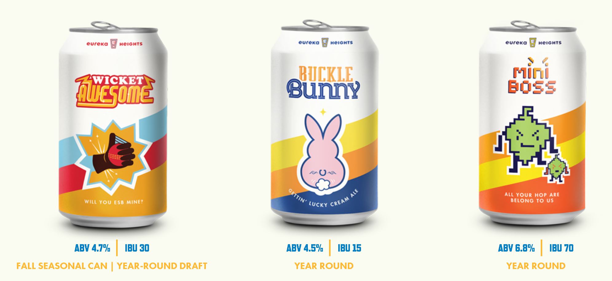
We looked at our friends at Eureka Heights and realized that they did an incredible job at differentiating their beers to have unique personalities.
While our coffees were explained by text on the label, their beers had characters and taglines and clever names that made each one feel special. Also, one of their beers is named Moo Caliente and has a picture of an udder/rocketship thing – I mean, c’mon!
We knew we wanted to have a similar shelf presence and make each coffee unique. Also, the “fun” aspect that Eureka Heights captured was impossible to ignore.
Early Mockups
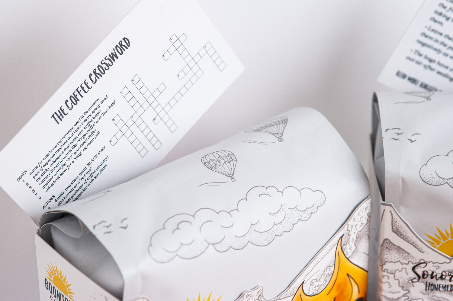
We first came up with the sleeve because we liked the idea of printing on the inside of it. Later on, we found that this was incredibly cost-prohibitive due to the nuances of large-scale printing ($4 sleeves!). Here’s another reason: if you haven’t met Nakita, this is Nakita:

An unsung hero of Boomtown, Nakita works on the production side of Boomtown. She was hand-stickering all of the old bags before making delivery runs all over the city.
Putting a sleeve over a bag is way easier than lining up a sticker. We want to keep Nakita.
So we ran with it. Here are some of the first prototypes:

Almost Settling
After a few months of prototyping, this was almost the final bag:

We liked it. It was clean, legible, and felt part of the Boomtown brand, at least aesthetically. But… it wasn’t enough. Something about the flavor notes on the front didn’t feel unique or fun enough.
That said, we spent several weeks just making iterations on this bag (messing with the fonts, a little more space here, nudge that a bit), and it felt like this was what we were going with.
The thought that it wasn’t right lingered, however.
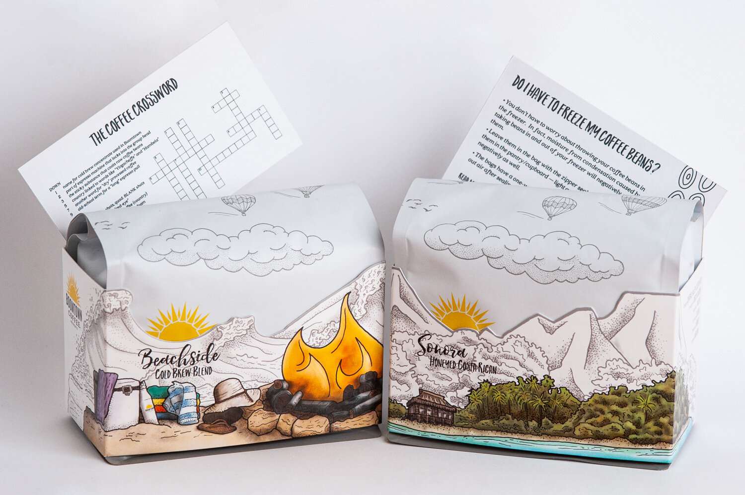
This is it!
While the last sleeve felt like trudging through mud getting all the details together, this last design came together in what felt like an instant. We talked about the general idea on the tail-end of a Friday. Andrew brought it into work on a Monday morning, and slapped it on the table. We knew “this is it”.
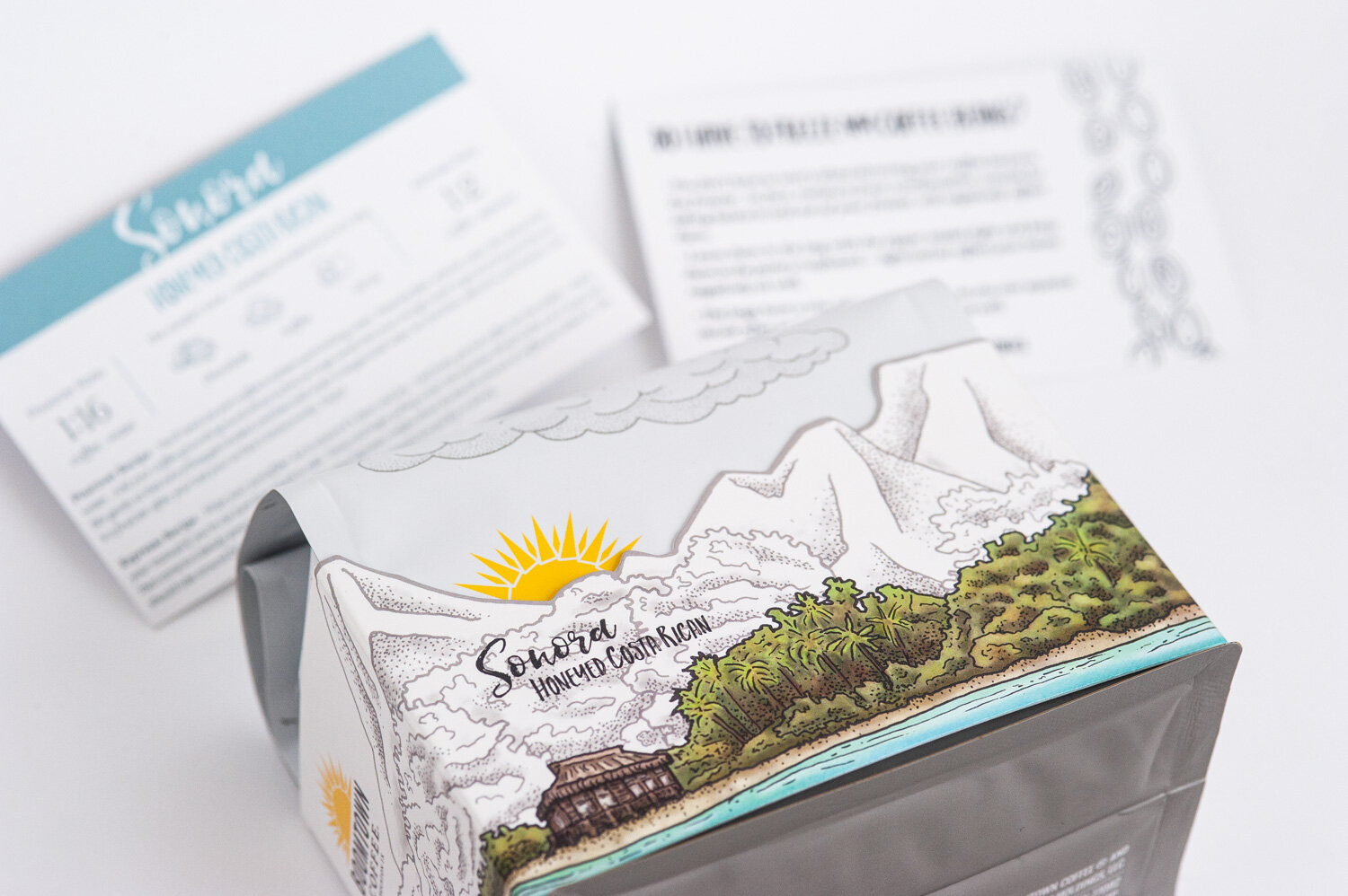
The bag was so playful, yet professional; the color stood out on the front with personality, and the showstopper – the mountain cutout leaving the sun peaking out from the back. We had seen so many packages over the past months, but we didn’t know anyone doing a bag like this.

CHOOSING MATERIALS
We started calling packaging companies instantly and started making orders. The bags are done by Savor Brands in Hawaii and the sleeves are printed by Folded Color in California.
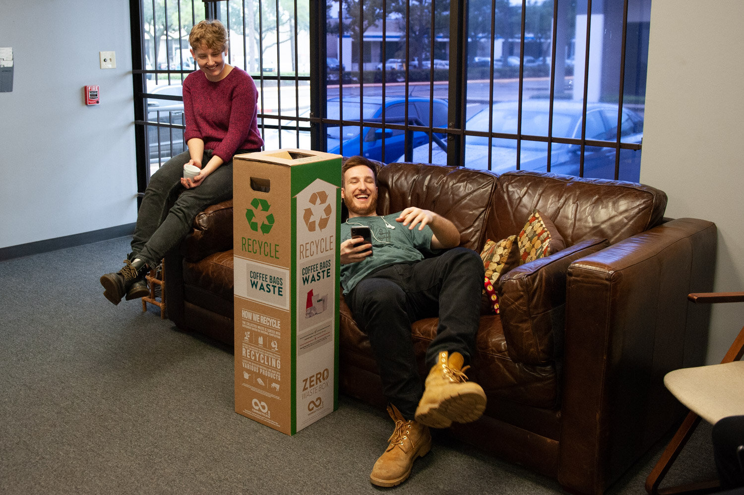
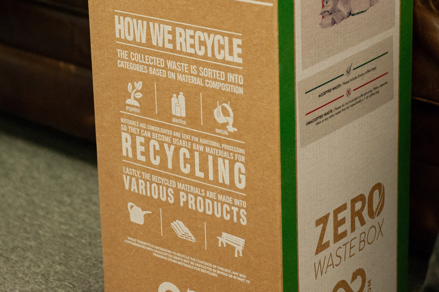
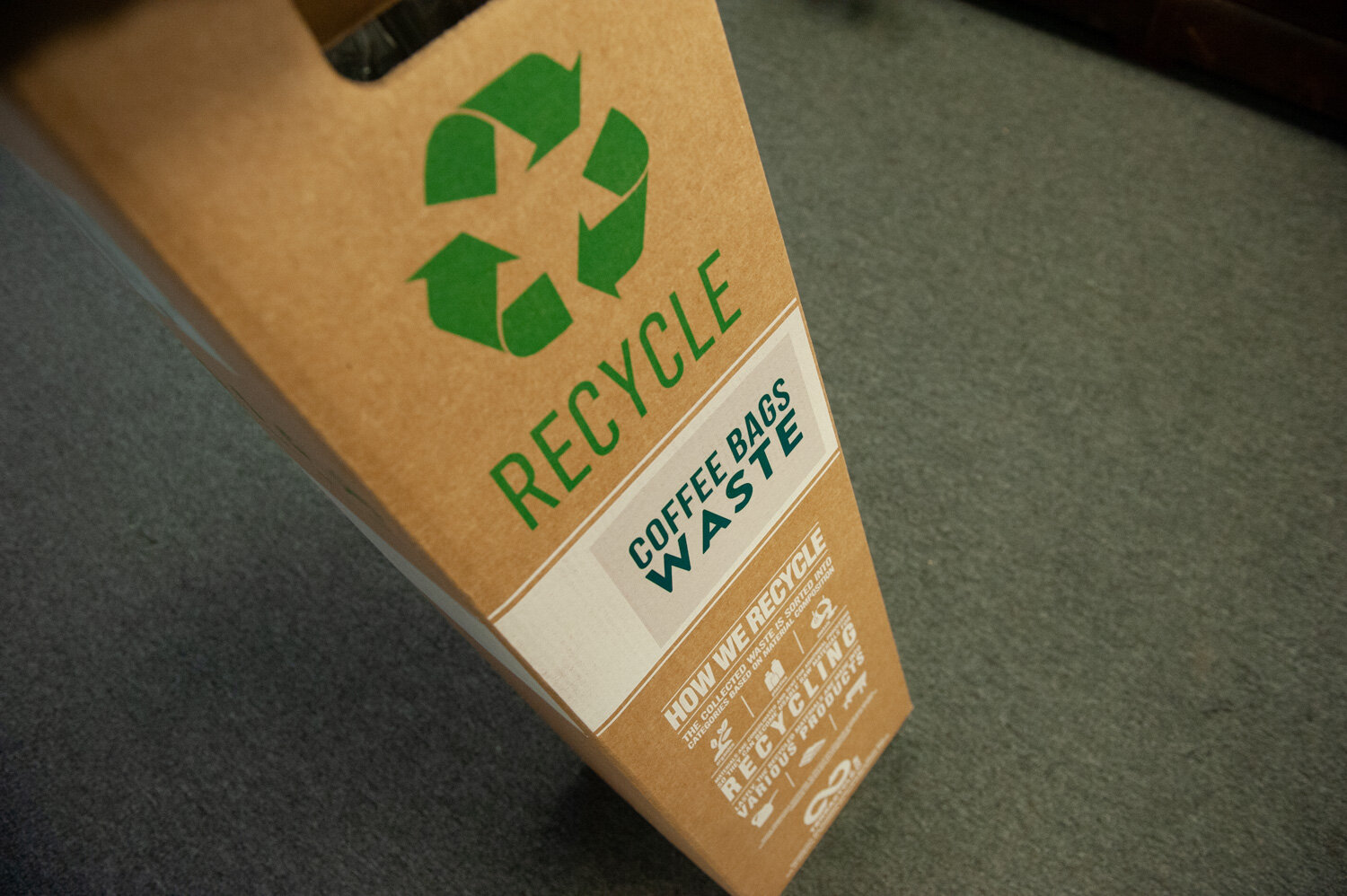
We’ve opted-in to Savor’s really awesome “Zero-Waste” program. Coffee bags have traditionally been difficult to recycle because they have a protective layer of thin aluminum. With this program, turn in your empty bag to one of our baristas and we’ll put it in this box. When we collect 10,000 bags, we’ll send the box off and they’ll get recycled from a specialty recycler called TerraCycle.
The FoldedColor sleeves are 100% Sustainable Forestry Initiative Certified (SFI). You can find more info about that here!
THANKS FOR KEEPING UP WITH US!
Boomtown’s getting bigger. We’ve spent a lot of time on big projects this past year, including the opening up the location at Understory. We hope that as we move forward, we take some time and keep Boomtown fun and interesting for all of our longtime guests but also approachable and welcoming for the people who are picking up a bag for the first time.